

How to Check Business Card Quality: 2026 Guide

Table of Contents
Quick Quality Check: What to Look For First
How Do You Check Business Card Quality Step by Step?
Business Card Paper Weight Guide: GSM and Card Stock Explained
The Impact of Paper Texture on Brand Perception
Best Business Card Finishes: Matte, Gloss, and Specialty Coatings
Print Resolution and Color Accuracy Tests
Physical Inspection: Tactile and Visual Quality Checks
How to Compare DIY vs Professional Print Quality
What About Aging and Long-Term Quality?
Frequently Asked Questions
Last Updated: September 21, 2026
Quick Quality Check: What to Look For First
You can judge a business card in about 30 seconds: run your thumb over the edge, hold it to the light, bend it gently. If it feels flimsy or bends like paper, it undercuts your brand every time someone pulls it from a wallet.
Key Takeaway A quality card feels heavy in the hand, shows no visible pixelation in logos or text, and survives a gentle bend without creasing. If it fails any of those three, the print quality is low.
How Do You Check Business Card Quality Step by Step?
Start with the physical checks:
Weigh it in your hand. A quality card should feel like a small stack of index cards, not a single sheet.
Bend it gently. It should flex and spring back, not crease or fold.
Hold it to light. Look for ink bleeding through the back.
Run your thumb over the edge. A sharp, clean cut feels smooth; a rough edge means dull trim blades.
Check text under a lamp. Small fonts should stay crisp, not fuzzy.
Look at the color. Reds, blues, and skin tones should look true, not washed out.
Sniff test. Fresh offset ink has a mild, clean smell; a chemical or burnt odor can signal a rushed job.
Business Card Paper Weight Guide: GSM and Card Stock Explained
GSM (grams per square meter): The metric standard, measuring the weight of one square meter of paper.
Points (pt): Sheet thickness in thousandths of an inch. A 14pt card is 0.014 inches thick.
Pounds (lb): The old U.S. basis-weight system, measuring 500 sheets at the paper's uncut size, so "80 lb cover" and "80 lb text" are wildly different papers.
Here's the practical translation table most buyers need:
Veesham Printing Press
GSM | Points | Feel |
250-300 | 10-12pt | Flimsy, bends easily, feels like cardstock from an office supply store |
350 | 14pt | The professional baseline. Sturdy, holds shape |
400 | 16pt | Noticeably thick, premium hand feel |
450+ | 18pt+ | Heavy premium stock, often duplexed (two sheets glued) |
Coated stock has a clay-based surface layer. Ink sits on top instead of soaking in, producing sharper detail and more saturated color, and it resists finger oils and moisture better. The trade-off: it can scratch and show scuffs under raking light.
Uncoated stock has a natural, fibrous surface. It takes pen beautifully, feels warmer, and hides fingerprints. The trade-off: ink absorbs into the fibers, so fine detail softens and the paper darkens over time from skin oils.
Pro Tip Ask for a paper sample before you order. Reputable printers will send a swatch pack so you can feel 14pt, 16pt, and 18pt side by side, and compare coated against uncoated in the same weight. Five minutes with physical samples beats any spec sheet, because stiffness and surface feel don't translate to a number.
A quick reality check on "heavy = quality." A 16pt card printed with low-resolution files and cheap ink looks worse than a crisp 14pt card. Weight sets the ceiling on how premium a card can feel; print quality determines whether you reach it.
The Impact of Paper Texture on Brand Perception
Texture tells the customer what kind of business you are before they read a word.
Smooth, coated stock reads as modern, tech-forward, and clean. Good for SaaS, finance, and agencies.
Linen or laid texture reads as traditional, established, and trustworthy. Good for law firms, accountants, and consultants.
Cotton or letterpress stock reads as luxury and craft. Good for designers, boutique retail, and premium services.
Recycled, uncoated stock reads as values-driven and sustainable. Good for eco-focused brands.
Best Business Card Finishes: Matte, Gloss, and Specialty Coatings
The finish is the surface treatment on the printed card, changing how light hits it and how the ink feels.
Matte finish: Soft, non-reflective, easy to write on. Hides fingerprints well.
Gloss coating: Shiny, high contrast, makes colors pop. Shows fingerprints and glare.
Soft-touch matte: Velvet-like feel, premium, popular for luxury brands.
Spot UV: Glossy raised coating applied to specific areas, like a logo. Creates visual contrast.
Foil stamping: Metallic foil pressed into the card. Gold, silver, copper, and custom colors.
Letterpress: Ink pressed into thick cotton stock, creating a debossed look and feel.
How they compare:
Finish | Feel | Durability | Best For |
Matte | Soft, dry | Good | Writing notes, clean look |
Gloss | Smooth, slick | Good | Bold colors, photos |
Soft-touch | Velvet | Fair (scuffs) | Premium brands |
Spot UV | Mixed | Good | Logo emphasis |
Foil stamping | Metallic, raised | Excellent | Luxury accents |
Letterpress | Debossed | Excellent | Craft, heritage brands |
Print Resolution and Color Accuracy Tests
Print resolution is measured in DPI (dots per inch). For business cards, 300 DPI is the minimum; anything below shows pixelation in logos and small text.
To check color accuracy on a printed card:
Look at skin tones. They should look natural, not orange or gray.
Check blacks. Rich black (a mix of all four inks) looks deeper than flat black.
Examine reds and oranges. These shift most between RGB and CMYK.
Look for color bleeding, where one color bleeds into another at the edges.
Physical Inspection: Tactile and Visual Quality Checks
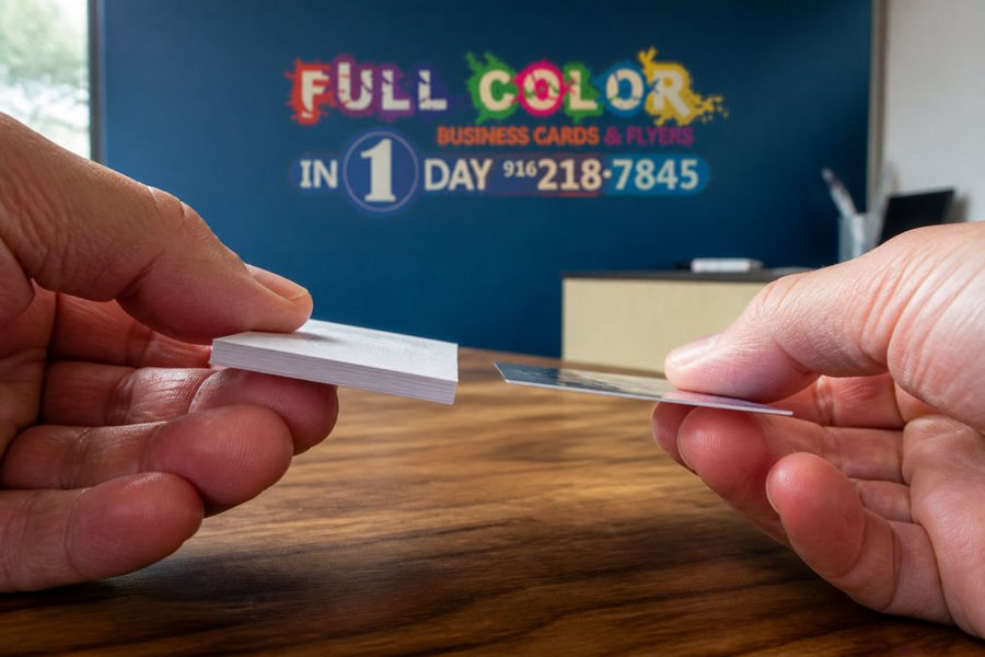
The edge test. Run a fingernail along the edge. A quality cut is smooth. A rough edge means dull trim blades or a rushed job.
The bend test. Flex the card between two fingers. It should spring back. If it stays bent, the stock is too thin.
The scratch test. Drag a fingernail across the finish. Soft-touch coatings scuff easily; matte and gloss resist better.
The opacity test. Hold the card up to a lamp. If you can see the design from the back, the paper is too thin.
The stack test. Fan a stack of cards. They should separate cleanly, not stick together from wet ink.
Watch Out Beware of cards that smell strongly of chemicals or feel slightly tacky. That usually means the ink didn't cure properly, and it will smudge in a wallet or on a humid day.
How to Compare DIY vs Professional Print Quality
Home and office printers can produce a business card in a pinch, but they can't match professional offset or digital printing:
Factor | DIY Home Printing | Professional Printing |
200-250 GSM max | 350-450+ GSM | |
Color accuracy | RGB, shifts on paper | CMYK, calibrated |
Resolution | Often under 300 DPI | 300+ DPI standard |
Finishes | None | Matte, gloss, spot UV, foil |
Edge quality | Rough, uneven | Sharp, trimmed |
Durability | Smudges, fades | Long-lasting |
What About Aging and Long-Term Quality?
The four failure modes, and what causes each:
Yellowing. Uncoated and recycled stocks contain lignin, which oxidizes and yellows with light and air. Coated stocks seal the fiber under clay and yellow far more slowly. If your brand needs a clean white background, uncoated recycled stock drifts toward cream within a year.
Fading. Pigment inks resist UV better than dye inks. Bright reds, oranges, and purples fade first under sunlight, a card on a dashboard can shift visibly in weeks. Ask your printer about UV-resistant or pigment-based inks if the card will see sun.
Scuffing. Soft-touch and matte laminated finishes scuff against other cards, keys, or wallet interiors. Gloss and bare coated stock resist better because there's no soft surface layer to mar. If you carry a stack, soft-touch shows wear fastest.
Curling. Paper absorbs and releases moisture with humidity. Thin stock curls first; thick stock resists because stiffness holds the sheet flat. A 14pt card in a humid climate can bow within weeks, while a 16pt card stays flat. Coated stock also resists moisture uptake better than uncoated.
The wallet test. Carry it in your wallet alongside your other cards for two weeks. Check for scuffs, edge wear, and color shift against a fresh sample.
The sun test. Tape a card to a south-facing window for a week. Compare it to a control card kept in a drawer. Any visible fade tells you the ink isn't UV-stable.
The rub test. Rub the printed surface firmly with your thumb 50 times. Soft-touch finishes will show a dull patch; matte and gloss should hold.
The bend-and-release test. Flex the card 20 times and check for a permanent crease or fiber cracking along the fold. Cracking means the stock or coating is brittle.
The humidity test. Leave a card in a bathroom or near a kettle for a few days. Watch for curling or waviness at the edges.
Watch Out A card that smells strongly of solvent or feels tacky to the touch is a red flag for long-term quality. That usually means the ink or coating didn't fully cure, and it will smudge, transfer, or stick to other cards in a wallet within weeks. Cure problems don't show up on day one, they show up after the card has been handled a dozen times.
The bottom line on aging. A card that looks premium today can look tired in six months if the stock, ink, and finish weren't chosen with wear in mind. Ask your printer what they recommend for your climate and use case, and run the wallet test on a sample before committing to 500 or 1,000 cards.
Frequently Asked Questions
What is the standard cardstock weight for high-quality business cards?
High-quality business cards typically use 14pt to 16pt card stock, which translates to roughly 300-400 GSM. Standard cards often use 12pt or lower. A quick test: hold the card at one corner and flex it gently. Premium card stock resists bending and snaps back into shape. If it flops over easily, the paper weight is too light for a professional impression.
Does paper texture affect how clients perceive my brand?
Yes. Uncoated and textured papers signal craftsmanship and approachability, while smooth coated stocks feel more corporate and modern. A 2024 study found that tactile impressions form within 0.1 seconds of handling a card. If your brand values sustainability or artisanal quality, a textured uncoated card reinforces that message before the recipient reads a single word.
How can I tell if a business card has a professional finish?
Check for even coating, no visible banding or streaks, and clean edges. Matte finishes should feel smooth without powderiness. Gloss should reflect light uniformly. Spot UV should be precisely registered to design elements with no blur. Foil stamping should be crisp with no flaking. If you see uneven sheen, color bleeding at edges, or a chemical smell, the finish is subpar.
How do I check for color accuracy in business card printing?
Compare the printed card to your digital proof under natural daylight, not office fluorescents. Skin tones should look natural, brand colors should match your style guide, and there should be no color bleeding between adjacent elements. CMYK printing cannot reproduce every RGB color, so some shift is normal. But if your navy looks purple or your red looks orange, the print run failed color management.
See Pricing Today


Comments