

Best Print Quality for Flyers: Paper, Color & Resolution

Table of Contents
What Actually Determines the Best Print Quality for Flyers
The Best Paper Weight for Flyers: Finding the Right GSM
How Paper Weight Is Actually Measured
Why Opacity Matters More Than Thickness on Double-Sided Flyers
80# vs 100# Text: When Each Weight Makes Sense
The Fold and Mail Trade-Off
Matching Weight to Audience
Paper Finishes: Gloss, Silk, and Matte Compared
How Finish Changes the Way Ink Reads
Matching Finish to Paper Weight
The Tactile Angle Most Guides Skip
CMYK vs RGB for Printing: Why Your Screen Colors Shift
Flyer Design Resolution Requirements: DPI, Bleed, and File Formats
Bleed, Crop Marks, and Safe Margins
Digital vs Offset Printing: Which Method Delivers Better Quality
Troubleshooting Common Flyer Print Failures
Frequently Asked Questions
Last Updated: September 28, 2026
What Actually Determines the Best Print Quality for Flyers
The best print quality for flyers comes down to four variables working together: paper weight, surface finish, color mode, and file resolution. Get one wrong and the whole piece looks amateur, no matter how good the design is. We see the same four issues cause most disappointing flyer runs, and all four are fixable before you hit "order."
The Best Paper Weight for Flyers: Finding the Right GSM
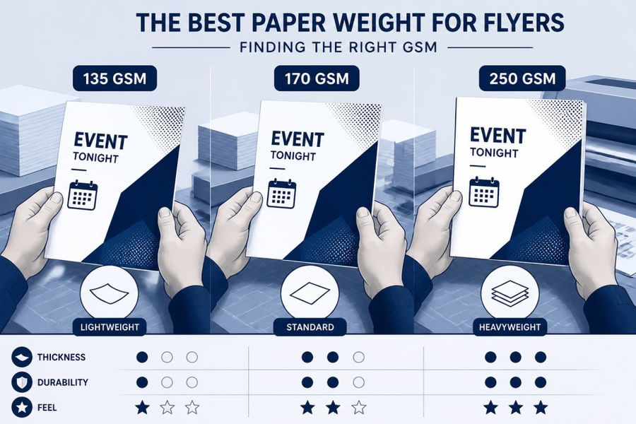
The best paper weight for flyers is 100# text (roughly 148 GSM) for handouts, sales collateral, and mailers you want kept, and 80# text (roughly 104 GSM) when budget or volume is the priority. Heavier stock signals a more premium brand and resists show-through on double-sided printing; lighter stock keeps per-piece cost down on large runs.
How Paper Weight Is Actually Measured
Paper weight is expressed three ways, and mixing them up is a common source of ordering mistakes:
GSM (grams per square meter): The international metric standard. Higher GSM means a heavier, thicker sheet.
Pound text (# text): The U.S. system for text-weight papers. 80# text and 100# text are the two workhorses for flyers.
Point (pt): Thickness in thousandths of an inch. A 10 pt cover stock is 0.010 inches thick. Point is used for cover stock and cardstock, not text weights.
Why Opacity Matters More Than Thickness on Double-Sided Flyers
Opacity is the sheet's resistance to show-through. It is driven by fiber composition, coating, and weight together, not weight alone. A 70# opaque text sheet can hide show-through better than a 60# gloss sheet because the opaque grade uses more fiber and less filler.
80# vs 100# Text: When Each Weight Makes Sense
80# text: Best for high-volume distribution, direct mail drops, and event handouts where you need thousands of pieces. It folds cleanly, mails at standard rates, and keeps per-piece cost low. Gloss at 80# is the standard mailer stock because it resists scuffing in the mail stream.
100# text: Best for sales collateral, trade show handouts, and anything a prospect will hold and keep. The extra stiffness reads as "professional-grade" and holds up better in a bag or folder.
100# cover (roughly 10-12 pt): The step up when the flyer doubles as a leave-behind or a rack card. Cover stock does not fold cleanly without scoring, so reserve it for flat pieces.
The Fold and Mail Trade-Off
A common mistake is ordering 100# gloss for a piece that will be folded and mailed. The heavier coated sheet can crack along the fold line if it is not scored first. Ask your printer to score any 100# coated flyer before folding, the score line compresses the coating so the fold breaks cleanly instead of fracturing the surface.
Matching Weight to Audience
Weight is a positioning decision as much as a production one. A 100# matte flyer handed to a prospect at a trade show says "this company invests in its materials." An 80# gloss flyer stuffed in a mailbox says "volume." Neither is wrong, but the weight should match the job the flyer is doing. If the flyer is a throwaway event handout, 80# is the right call.
Key Takeaway Choose weight by asking two questions: Will it be folded or mailed? Will the recipient keep it? Folded and mailed → 80# text, gloss. Kept and handed over → 100# text or cover, matte or silk.
Paper Finishes: Gloss, Silk, and Matte Compared
Finish is the coating applied to the paper surface, and it controls how ink sits on the sheet, how light reflects off it, and how the piece feels in hand. The three mainstream options, gloss, silk (also called satin or dull), and matte, are not just cosmetic. They change color vibrancy, scuff resistance, write-ability, and how the flyer photographs.
Finish | Surface | Color Vibrancy | Ink Behavior | Best For | Watch Out For |
Gloss | Reflective, smooth | Highest | Ink sits on top; sharpest dot reproduction | Photo-heavy flyers, retail promos, food menus | Fingerprints, glare under overhead lights, hard to write on |
Silk / Satin | Low-sheen, smooth | High | Ink absorbs slightly; softer contrast | Mixed text-and-image collateral, brand pieces, catalogs | Slightly muted vs. gloss; less "pop" on dense photos |
Matte | Non-reflective, slightly textured | Moderate | Ink absorbs more; colors read flatter | Luxury brands, write-on pieces, minimalist design | Scuffs and fingerprints show as shiny marks; deep blacks can look gray |
Uncoated | Porous, textured | Lowest | Ink soaks in; colors soften and warm | Letterpress-look pieces, eco-positioned brands, forms | Colors shift noticeably; fine detail can fill in |
How Finish Changes the Way Ink Reads
On a coated gloss sheet, ink cures on the surface, so dots stay crisp and colors stay saturated. That is why gloss is the default for photo-driven flyers. The trade-off is reflectivity: under a trade show spotlight or a restaurant pendant lamp, a gloss flyer becomes a mirror and the image disappears.
Matching Finish to Paper Weight
Finish and weight are chosen together, not separately. A 100# gloss text sheet feels substantial and photographs well, but it cracks along folds unless it is scored first. A 100# matte sheet folds more cleanly because the coating is less brittle. If your flyer will be tri-folded or mailed, matte or silk at 100# text is the safer combination than gloss at the same weight.
The Tactile Angle Most Guides Skip
Finish is the first thing a recipient feels, before they read a word. A soft-touch matte laminate or an uncoated textured sheet communicates "premium" in a way that a glossy sheet cannot, because gloss is now the default for cheap takeout menus and door hangers. If your brand competes on craft, hospitality, or design, a matte or uncoated finish at a heavier weight does more positioning work than a brighter color ever will.
Pro Tip Order a sample pack from your printer that includes the same artwork printed on gloss, silk, matte, and uncoated stock. Comparing the same file across finishes is the fastest way to see how much your specific colors shift, and it costs far less than reprinting a full run.
CMYK vs RGB for Printing: Why Your Screen Colors Shift
Printing uses CMYK (cyan, magenta, yellow, black) ink, while screens display RGB (red, green, blue) light. Converting an RGB file to CMYK at the printer stage shifts colors, often dulling bright blues, greens, and oranges.
Flyer Design Resolution Requirements: DPI, Bleed, and File Formats
Flyer design resolution requirements start at 300 DPI at final print size. Anything lower risks pixelation, especially on photos and logos. Vector graphics (logos, icons, type) scale without loss; raster images (photos) do not.
Bleed, Crop Marks, and Safe Margins
Bleed: Extend background colors and images 0.125 inches past the trim edge on all sides.
Crop marks: Thin lines at the corners showing the printer where to trim.
Safe margin: Keep all text and critical elements at least 0.125 inches inside the trim line.
Skip the bleed and you'll get thin white slivers along the edges after trimming. Push text into the margin and it gets clipped. Both are among the most common file prep failures we correct.
Digital vs Offset Printing: Which Method Delivers Better Quality
Offset printing delivers color depth and consistency on large runs; digital printing wins on speed and short-run economics. For runs under roughly 500 pieces, digital is faster and more affordable. Above that, offset's setup cost amortizes and the per-piece price drops.
Troubleshooting Common Flyer Print Failures
Most flyer print failures trace back to one of five file or specification errors, and all five are preventable before you submit.
Washed-out colors: The file was built in RGB and converted late. Rebuild in CMYK and proof before reprinting.
Pixelated images: Photos were scaled up beyond their native resolution. Source images at 300 DPI at final size.
White edges after trimming: No bleed was added. Extend backgrounds 0.125 inches past trim.
Show-through on double-sided flyers: Paper is too light. Move up to 100# text or add opacity via a heavier sheet.
Cracked folds: Coated heavy stock was folded without scoring. Ask for a score line.
Pro Tip Ask for a printed proof on the actual paper stock before committing to a full run. Screen proofs lie about color, and the paper finish changes how ink reads more than most people expect.
Frequently Asked Questions
Should flyers be glossy or matte?
Glossy paper makes colors pop and works well for photo-heavy flyers, but it can show fingerprints and glare under bright lights. Matte offers a softer, more sophisticated look that is easier to read and write on, making it a strong choice for text-heavy designs. Silk sits between the two, reducing glare while keeping colors vibrant. The right pick depends on your design and where the flyer will be distributed.
What is the recommended DPI for professional flyer printing?
Professional printers recommend 300 DPI at the final print size for sharp, clear flyers. Lower resolutions cause pixelation, especially in photos and logos. If your design is 150 DPI, it may look acceptable on screen but will appear soft or blurry in print. Always check resolution before exporting, and keep original vector files for logos and text so they stay crisp at any size.
How does paper weight affect the perceived quality of a flyer?
Heavier paper feels more substantial and signals a higher-quality brand. A 100# text weight flyer resists bending and show-through, while thinner 80# text works for high-volume handouts where cost matters more. Paper opacity also plays a role: thicker stock blocks ink from the reverse side, keeping both sides readable. For premium events, heavier stock paired with a matte or silk coating makes the strongest impression.
How can I ensure my flyer colors look the same in print as on screen?
Convert your design from RGB to CMYK before sending it to print, and use a calibrated monitor so what you see is closer to what you get. Request a proof or a printed sample when possible, especially for brand colors. Keep in mind that CMYK cannot reproduce every neon or metallic shade you see on screen, so adjust expectations for extremely bright colors and check that your color profile is set correctly.
What file format is best for sending designs to a professional printer?
PDF is the standard for professional printing because it preserves fonts, layout, and vector graphics. Export at 300 DPI with CMYK color mode, include 0.125-inch bleed on all sides, and embed crop marks. Avoid sending JPEGs for text-heavy flyers since compression can blur edges. If you are not a designer, many print shops offer semi-custom design help and can work with your content to produce a print-ready file.
See Pricing Today


Comments